Documentation
OPEN·SENSOR·WEB has extensive functions for searching, visualizing and analyzing environmental data. The following functions are available.
Search
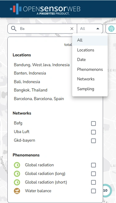
The data in OPEN·SENSOR·WEB can be searched and filtered based on various aspects.
The All mode allows searching and filtering for networks, locations and phenomena within a compact view.
These modes can also be used in a standalone view.
The Date mode allows sensors to be filtered based on the date of data availability using date information. The input is either via a graphical calendar selection or via manual entry into the input field.
The Resolution mode allows filtering of sensors based on the temporal resolution of the data. The input is via a graphical slider or via the input of the resolution in ISO notation.
The topic bubbles serve both as feedback from which topics phenomena are selected and as input elements for quickly selecting and deselecting all phenomena within a topic.
Visualization & Analysis
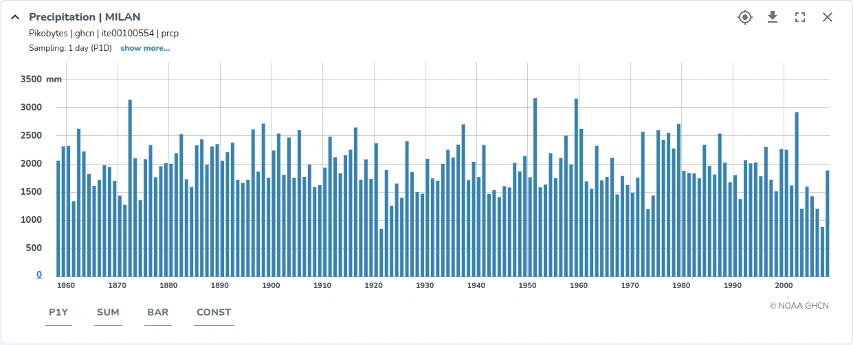
OPEN·SENSOR·WEB allows full access to the entire time series - sometimes spanning several decades or even centuries. Our slippy-chart technology allows high-performance and interactive work with the data. Even long time series with hundreds of thousands or millions of data points can be loaded and visualized quickly.
Individual sensors can be selected via the map and displayed in their own chart.
-
First select the desired location on the map and then chose "Add Sensors" in the pop-up window.
-
You can display the data chart using the "show charts" function. The last selected sensor is prepended to the start of the charts tab.
The time series chart provides the following functions.
| Function / Button | Description |
|---|---|
| Axis scaling (Last element on the y-axis) | The vertical axis is automatically adjusted to the global min/max values of each time series. The input fields allow modification of the min/max values according to your preferences. |
| Temporal resolution | Here you can select the time resolution of the measured values for the display. Without manual intervention, this is automatically calculated and taken into account. It must currently be specified in the ISO notation. |
| Aggregation method | Mean or sum values can be displayed. Normally the default setting fits. |
| Chart type | It is possible to select between different chart types, e.g. line and bar charts. |
| Interpolator | Time series occasionally have gaps. You can choose which interpolation method is to be used for thse data gaps. Available methods are linear, constant or nearest value. |
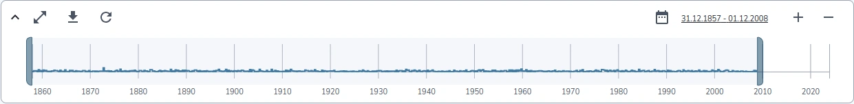
An overview chart gives an overview of all selected time series. The overview diagram allows in particular the selection of time periods and serves the fast navigation over large time periods. In the top menu further functions are offered, which refer to all displayed time series:
-
Toggle the overview chart on and off
-
Display all charts side by side in fullscreen mode, hiding the map
-
Download the data of all selected sensors
-
Refresh data
-
Select the displayed time extent via a graphical date picker
-
Zoom in and out
Download
The data can be downloaded either individually per sensor (icon directly on the chart) or for all selected sensors (icon above the display next to the time period).
| Field | Description |
|---|---|
| Resolution | Temporal resolution of the measurement series, currently specified in ISO notation. The measurement series can be requested for example in raw, which corresponds to the raw data. Then it can be requested aggregated for example to 15 minutes (PT15M), hourly (PT1H) or daily (P1D). |
| Time Extent | Period for which the time series is downloaded. "Chart" uses the time period that is currently displayed in the chart. "Full" means the entire period of time covered by the time series. |
| Format | Format in which the data is downloaded. You can choose between CSV or JSON. |
| Columns | For aggregated values there are also the columns "Min/Max" and "Coverage". "Min/Max" indicates the fluctuation range of the measured values within a time slice; "Coverage" indicates the coverage of measured values. A coverage of 0.9 means that measured values are only available for 90% of the time slice. The rest are data gaps. For certain analyses this can be an important information. |
| Aggregation | Here you can select the aggregation method for measured values. Available options are "Mean" and "Sum". |